
Time Well Spent Score
An alignment score that measures how closely your week matched what you value, not how much you produced.
These images are illustrations of the concept, not screenshots of the actual product.
Overview
The Time Well Spent Score is the concept's answer to productivity scores that reward more hours and more output. It measures alignment instead: how closely the way a person actually spent their week matched the values and target balance they declared. The illustrations say this plainly in the interface, labeling the number as not a productivity score and explaining that a long walk with a friend can score high while a busy day that touched nothing the person values can score low.
Most time analytics count volume, which quietly pushes people toward working longer. A score that anyone could raise by working more would undermine the purpose of the Life Intelligence area. This concept is designed so that it cannot: it compares proportions, so time spent beyond a domain's intended share widens the gap rather than raising the score.
Two illustrations show the idea at different depths. The first is a focused summary: a large score ring out of one hundred, captioned as alignment with what you value, above a card for each value such as family, health, craft and learning, and rest. Each card shows hours spent against hours intended and a status chip that flags where time fell short. The second is an explainable breakdown with week, month and quarter views. It pairs an alignment score ring with a coverage card that shows how much of the window is accounted for and the hours tracked, and it warns when coverage falls below a threshold so the score should be read as a rough estimate. A How this is computed card sets out the rules in plain language: proportions only, no declared values means no score rather than a zero, and overlapping sources are merged rather than double counted. A table lists each domain's actual share, desired share and gap.
The score depends on the values and targets set in Values, Goals and Life Balance, and it is one of the signals that values-aware recommendations draw on. Its emphasis on showing its workings reflects the product's wider stance that insight should be honest and legible.
What this concept shows
- A headline score out of one hundred, labeled as alignment with what you value and explicitly not a productivity score
- Per-value cards showing hours spent against hours intended, with status chips
- Week, month and quarter views of the alignment score
- A coverage card showing the share of the window accounted for and the total hours tracked
- A low-coverage notice that asks you to treat the score as a rough estimate
- A How this is computed card that states the scoring rules in plain language
- A table of actual share, desired share and gap for each life domain
How it works
- Declare values and weekly targets so the score has something to measure against.
- Open Time Well Spent to see the headline alignment score and the per-value cards.
- Switch between week, month and quarter to see how alignment changes over time.
- Check the coverage card and its notice before relying on the number.
- Read the How this is computed card and the actual-versus-desired table to see which domains pulled the score down.
Who it's for
- Individuals who want a meaningful measure of their week
- Knowledge workers wary of output-based productivity scores
- People rebalancing time toward family, health or learning
- Anyone who wants to understand how a score is calculated before trusting it
Illustrations
2 illustrations of this concept. Select one to view it full size.
Time Well Spent at a Glance
This illustration shows the Time Well Spent summary in a desktop layout with a slim left rail for Dashboard, Values, Reports and Settings. At the center, a large glowing ring displays a sample score out of one hundred, captioned as alignment with what you value, with a line stating that this is not a productivity score. Below it, four cards cover family, health, craft and learning, and rest. Each card has an icon, a status chip, a gradient progress bar and a pair of figures showing hours spent against hours intended; where the two match, the card shows an on-track indicator instead of a warning chip. A closing line explains that a long walk with a friend can score high while a busy day that touched nothing you value can score low. The design demonstrates a score built on meaning rather than output.
How the Alignment Score Is Computed
This illustration shows the Time Well Spent page inside the full application layout, with the Life group expanded in the sidebar alongside Life Timeline, Life Balance, Life in Weeks, Dead-Time Radar, Values & Goals, Recommendations and Personal & Corporate. The header offers Week, Month and Quarter views. A ring card shows the alignment score as a percentage. A coverage card reports how much of the window is accounted for and the hours tracked, with an amber notice that coverage below eighty percent should be treated as a rough estimate. A How this is computed card explains that the score uses proportions only so more work cannot raise it, that no declared values means no score rather than zero, and that overlapping sources are unioned, never summed. A table titled Where your time went vs where you wanted it lists domains with actual share, desired share and a colored gap chip. The design demonstrates explainable, trustworthy scoring.
Topics
- time well spent score
- values alignment score
- not a productivity score
- meaningful time metric
- actual vs desired time share
- explainable time analytics
- life balance score
- intentional time use
- weekly alignment report
Related concepts
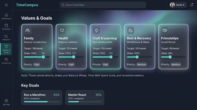
Values, Goals and Life Balance
Declare what matters and the weekly balance you want, then see how your real week compares, on desktop or phone.
3 illustrations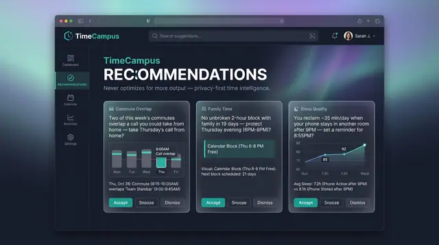
Values-Aware Recommendations
Personal, evidence-backed suggestions grounded in your own week, with guardrails that never push for more output.
2 illustrations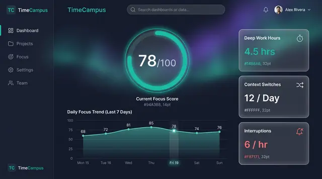
Focus Score and Work Patterns
A single focus score, the deep-work and interruption figures behind it, and the weekly rhythm that explains both.
2 illustrations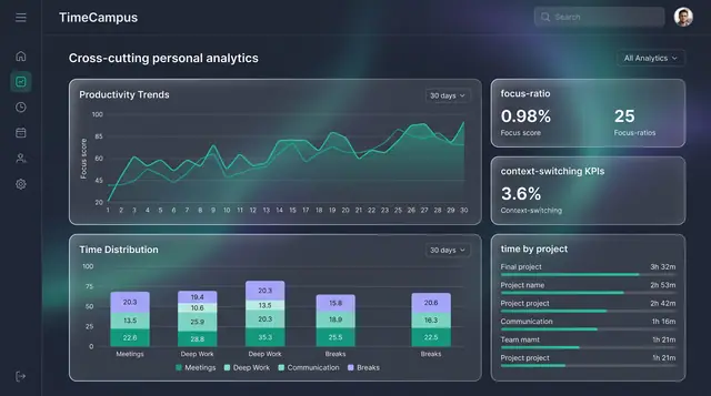
Personal Analytics and Reports
Turn captured time into trends, time distribution and project totals, then export the findings as ready-made reports.
2 illustrations